12 Best Practices to Improve User Onboarding Process

“Onboarding is about so much more than just signups and profiles.”
Before we drill down on best practices let’s look at a few stats to understand the importance of onboarding.
A survey has shown that-
63% of customers think onboarding is critical to subscribing to a product. If the onboarding process is complicated, 74% of potential customers will switch to other solutions.
Not just that another study by Gartner reveals that effective onboarding increases an employee’s discretionary effort by 20%.
On customer onboarding, Joff Bezos said-
“We see customers as guests to a party, and as hosts, it’s our job every day to make every important aspect of the customer experience a little bit better.“
The Sanskrit phrase “Atithi Devo Bhava” means “Guest is God.”
Companies should treat every client like a revered guest, providing impeccable service that creates unforgettable experiences they’ll eagerly recommend to others. To foster loyalty, onboard potential customers with warmth and top-notch hospitality.
Have you ever signed up for a new app or service only to feel lost after onboarding? We all certainly have. We often need clarification if we understand how to use whatever we just signed up for.

Onboarding is about guiding new users and helping them understand the basics and how to get value from your product or service. It sets the stage for whether they’ll stick around or leave in frustration. As someone who has experienced both good and lousy onboarding experiences, we will share 12 best practices we’ve learned to improve your user onboarding process based on what works to connect with people.
The goal here is to welcome new users, get them comfortable and confident using your stuff, and make them eager to return for more. Done right, this can be the difference between retaining users and watching them disappear without a trace. Let’s now look at some strategies to level up your onboarding game.

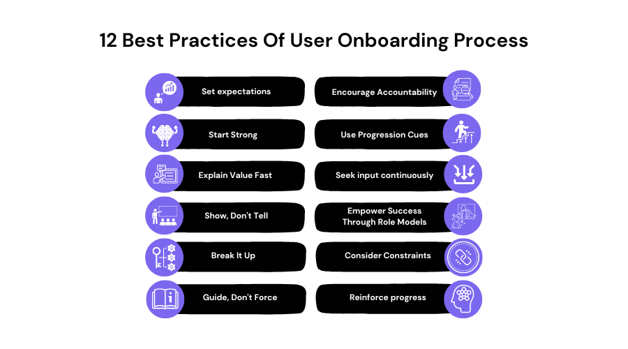
12 Best Practices to Improve User Onboarding Process
1. Set Expectations
Give users a clear overview of what to expect from the onboarding process upfront so they feel reassured.
When onboarding new users onto the platform, it’s essential to set clear expectations about the process. Users should know approximately how long onboarding will take, what areas of the tool they will be introduced to, and the overall goals of helping them maximize productivity. Setting expectations reassures users and helps them feel prepared to get the most value out of their time.
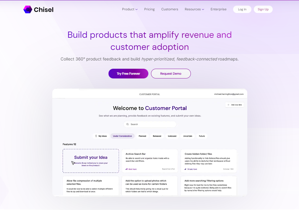
You can use an onboarding tool or a PM tool like Chisel. A tool can outline the key stages and time estimates on initial login to set the right expectations. Users feel reassured having a clear “end in sight”.
Some ways a tool could do this:
- Display a stages/modules tile board on the main dashboard
- Include an expectations page users can reference at any time
- Show estimated completion times for each step
Users should know approximately how long onboarding will take, what areas of the tool they will be introduced to, and the overall goals of helping them maximize productivity. Setting expectations reassures users and helps them feel prepared to get the most value out of their time.
2. Start Strong
Greet users personally and get their buy-in from the beginning with a short, compelling intro to hook their interest.
A welcoming screen highlighting the platform’s top benefits is a great way to start. A short video demo immediately engages users by showing how easily it can be done. This helps users understand the value and get excited about streamlining their workflows.
Another popular way to hook interest early is to welcome new users by name, which creates a personal touch. A compelling intro video keeps them engaged.
Some tactics you could use:
- Personalized greeting pop-up with a quick intro video
- Welcome email with name and a brief demo of top benefits
- Shareable quick start guides for quickly explaining value -Highlighting real customer success stories and critical wins upfront incentivizes investing time to learn.
3. Explain Value Fast
Users want to understand the tangible benefits of whatever they are learning. Communicating value propositions upfront is essential so users feel the time investment will be worthwhile. It also helps them envision possibilities and stay engaged throughout the process.
It’s essential to quickly highlight top benefits so users feel optimistic about investing time in onboarding. A tool can briefly showcase key capabilities and success stories upfront to resonate with why it’s worth learning.
Some approaches could include:
- 2-minute intro video summarizing top features and their impact
- Sortable tiles listing the top 5 features with brief explanations
- Testimonials from example users explaining the gains they achieved
4. Show, Don’t Tell
Rather than text-heavy instructions, you should leverage its digital product’s interactive nature with guided video tutorials and real examples. Users are walked through actual workflows, like here at Chisel, where we show conducting a survey, building a feature roadmap, and enabling team alignments. This engages users in an immersive, hands-on way that complements understanding more effectively than plain step-by-step lists.

Telling is a passive learning method while showing through interactivity and examples are actively involved. Interactive learning cements understanding far better because users experience concepts firsthand rather than just hearing about them. It also keeps the process more engaging and enjoyable.
Ways a tool could showcase rather than explain:
- Short tutorial videos walking through realistic workflows
- Interactive mini-games simulating core functions
- Screen recordings of actual templates, tools in use
5. Break It Up
Separate onboarding into short, digestible modules or micro-interactions to keep it engaging and prevent fatigue.
Onboarding processes that are too lengthy can lose user attention and energy. Breaking content into digestible chunks avoids information overload. It also allows flexibility for users to learn at their own pace and focus on the most relevant sections for their needs.
For example, Chisel separates onboarding into intuitive modules focusing on a core area of the tool to prevent information overload. Users can choose their own pace and revisit any section as needed. Bite-sized micro-interactions keep the process light and engaging and help optimize the retention of key concepts.
6. Guide, Don’t Force.
Suggest helpful pathways through prompts and tools but don’t force linear restrictions, respecting individual paces and needs.
A one-size-fits-all approach to onboarding ignores that individual users have unique backgrounds and goals. Respectfully guiding users allows customization that keeps the experience tailored and optimized for adoption. Forcing a rigid path risks disengagement if users feel unable to self-determine.
Suggestions facilitate progress better than restrictions. Respect for individual needs boosts morale.
Techniques a tool could apply:
- Optional pathway recommendations based on user profile
- Ability to freely explore without a set linear path
- Contact support if particular help is desired
The goal is to nurture engagement, understanding, and confidence through personalized approaches tailored to users’ needs and preferences.
7. Encourage Accountability.
Get users invested by asking them to make simple commitments, set up profiles, or connect social accounts.
One of the most complex parts of any goal or habit change is staying motivated long-term. It’s easy to get excited initially but then lose steam as real life gets in the way. Product managers can help by encouraging users to feel invested and accountable from the start.
When users first sign up, ask them to:
- Please create a profile with their name, photo, and a short bio. Getting users to share personal details makes the experience feel more social and meaningful.
- Connect their social accounts so their progress can be visible to friends. Knowing others may see their activity can light a small fire under users.
- Make a simple public commitment, whether stating a goal or pledging to use the tool for 30 days. Getting users to put something out there boosts their follow-through.
- Set up reminders or notifications, so the app gently nudges them along their journey. Out of sight is out of mind – prompt reminders keep users engaged.
8. Use Progression Cues.
Give regular positive feedback on tasks completed to motivate continued progress and reassure users they’re on the right path.
Regularly updating a progress indicator on a user’s dashboard can reinforce positive feedback about tasks completed. Automated emails at milestones reassure users.
No one likes to feel they’re failing or doing something wrong. A little praise and encouragement go a long way in motivating continued efforts. Product managers should design subtle ways for users to track their progress and get positive feedback.
For example, many fitness apps will:
- Show a visualized progression of tasks completed, like a moving bar that fills up.
- Give celebratory badges or trophies for milestones like logging workouts each week.
- Automatically compile before/after photo slideshows to visibly see changes over time.
9. Empower Success Through Role Models
We’re all inspired when we see others achieve what may seem impossible or out of reach for ourselves. Product managers can leverage this human trait by spotlighting top users.
For example, wellness apps may feature:
- Profile stories from people who’ve lost significant amounts of weight through the program.
- Testimonial videos from Fitbit users who’ve become exercise fanatics since signing up.
- Case studies show how some entrepreneurs used the tool to grow their small businesses.
Putting real human faces and stories behind what’s possible motivates users to feel like, “If they can do it, We can too.” Highlighting advocates gives users confidence in the system and their own potential for success.
Highlight power users who’ve found success to inspire confidence that others can achieve their goals.
10. Consider Constraints
Setting boundaries encourages completion. However, forcing linear paths risks disengagement. Nudges versus restrictions better respect individual needs.
Gentle constraints could include:
- Soft deadlines for modules indicated on a progress meter
- Optional timeboxing suggestions for sections based on profile
- Check-in notifications if paused long between chapters
Some examples include:
- An HR onboarding platform sets soft deadlines of 2 weeks for new hire onboarding modules to be completed.
- A SaaS tool recommends timeboxing training sessions to 25 minutes based on user role (support staff vs executives).
- An eLearning course nudges users with notifications if they have been inactive on a lesson for over a day.
11. Reinforce Progress
Keeping accomplishments visible inspires continuing. Positive reinforcement strengthens learning motivation.
Progress reminders may consist of the following:
- Weekly recap emails highlighting lessons and new features
- Achievement badges awarded in profiles for milestones
- Push notifications about upcoming optional advanced training
Let’s look at a few examples here that will shed better light:
- An investment app sends weekly emails highlighting the new education materials and tools unlocked as users achieve higher account tiers.
- A design software awards digital badges like “expert illustrator” that appear on user profiles when certifications are obtained.
- A health platform notifies users of optional advanced webinars that are available as they near workout goals.
12. Seek Input Continuously
Evolving needs require dynamic improvement. Continuous feedback refines the experience based on actual usage.
Ways to encourage ongoing feedback could include:
- Optional satisfaction surveys after critical tasks or signup
- Feedback forums to discuss value, pain points, ideas
- Front-line support channels where guidance is appreciated
The goal is nurturing engagement and understanding through personalized, supportive approaches tailored to individuals’ circumstances and evolving requirements.
- After their first client project, an accounting program surveys customers about onboarding experience and future training needs.
- An AI assistant forum allows users to post questions and upvote the most common topics, which the product team then prioritizes.
- A language learning app integrates live chat support so users receive guidance while practicing interactive lessons.
The examples provide more apparent contexts of how organizations can implement the best practices for onboarding across different use cases.
Conclusion
Whew, those are some excellent best practices to keep in mind to improve user onboarding! Small touches like personalizing the experience, breaking it into digestible chunks, celebrating milestones, and continually getting feedback can go a long way in setting users up for success and ensuring they get maximum value from your product. Onboarding is essential for building initial connections and trust with new users.
If this blog has you thinking about leveling up your onboarding process, we recommend checking out our tool. Looking for seamless onboarding for your PM software? The guided, interactive approach to explaining core concepts shown here is sure to impress.
